
FINAL REPORT
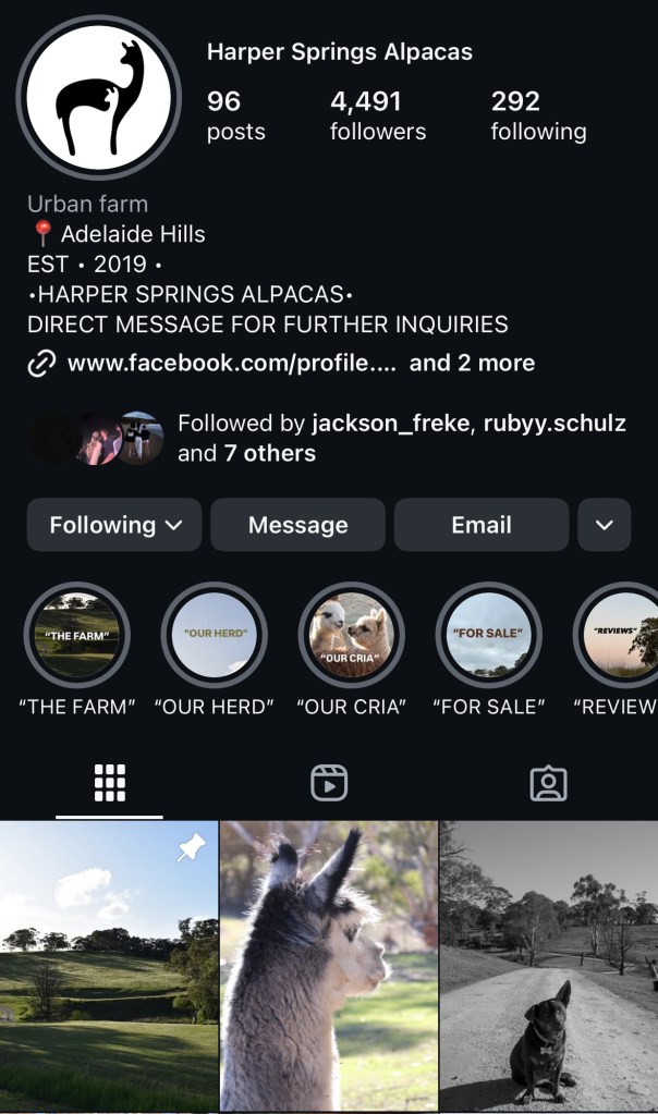
Harper Springs Alpacas
Concept and Overview
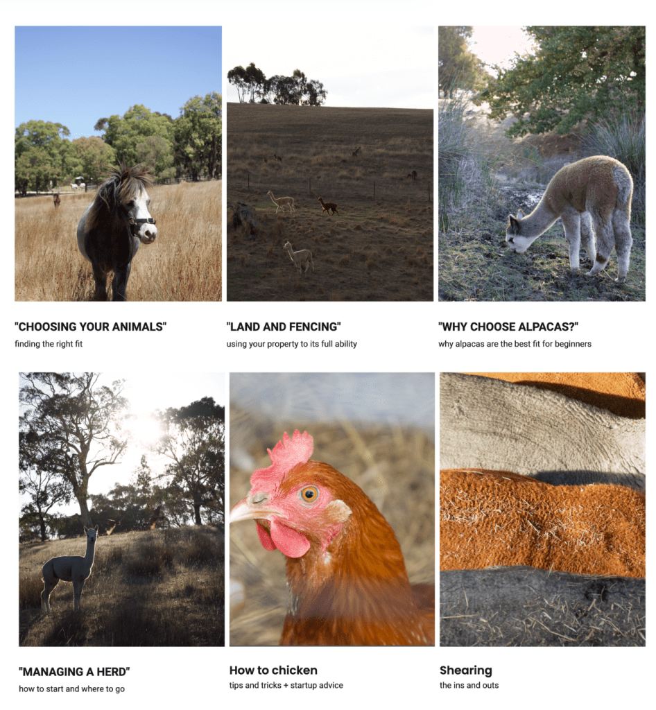
Harper Springs Alpacas is an informative blog with guides and ‘how to’ tips and tricks that feature hobby farm advice. The Blog content is personalised for niche topics and users are able to directly contact the business with personal questions, making it unique from other forms of Blogs. Within the blogs a variety of topics are offered such as:
- Choosing the right animals
- Land and fencing
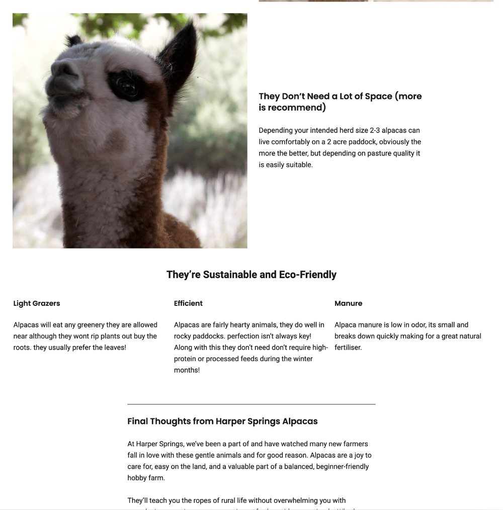
- Why choose alpacas
- Managing a heard
- How to chicken
- Shearing
Having a wide range in topics allows my audience to easily find information and new advice that could be beneficial to their understandings, furthermore the frequent access to inquiry drop boxes further allows for a more personal and informative user experience. The primary intended audience for my blogs are young families /new property owners who are looking for information and advice on how to utilise their property to their full potential, as my blog is based on hobby farming and Australian livestock/land the blog is best suited for an Australian audience. However my second intended audience extents to social media based content who enjoy watching and being a part of the hobby farming content.
As I will be primarily posting farming content and advice I expect my intended audience to be between the ages of 19 – 35 as they are more likely to be in the positions to looking for new pets and owning newer properties. My blog is aimed to be assessable and contain a user friendly interface that any age range is able to navigate.

Visual Communications and design
(Zhang, 2017) explains “visual communication design is the development trend of the information age, interface design, is based on information delivery and aesthetic purposes, Visual communication design in digital media is mainly through the interface as a carrier for information presentation, the external manifestations of the screen” I prioritised my visual design based off of simplistic yet bold photography in order to retain viewer attention.
After understanding how I wanted my photography to look I wanted to continue these themes through social media platforms and my website in order to make the brand uniform. I used basic tools on photoshop to touch up images, fix lighting and simplify backgrounds in order to achieve my visual design as seen below.

With this image i took away background sicks and other distracting items 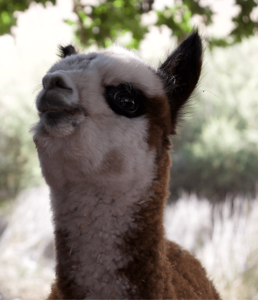
This image was cropped in order to centre the alpaca 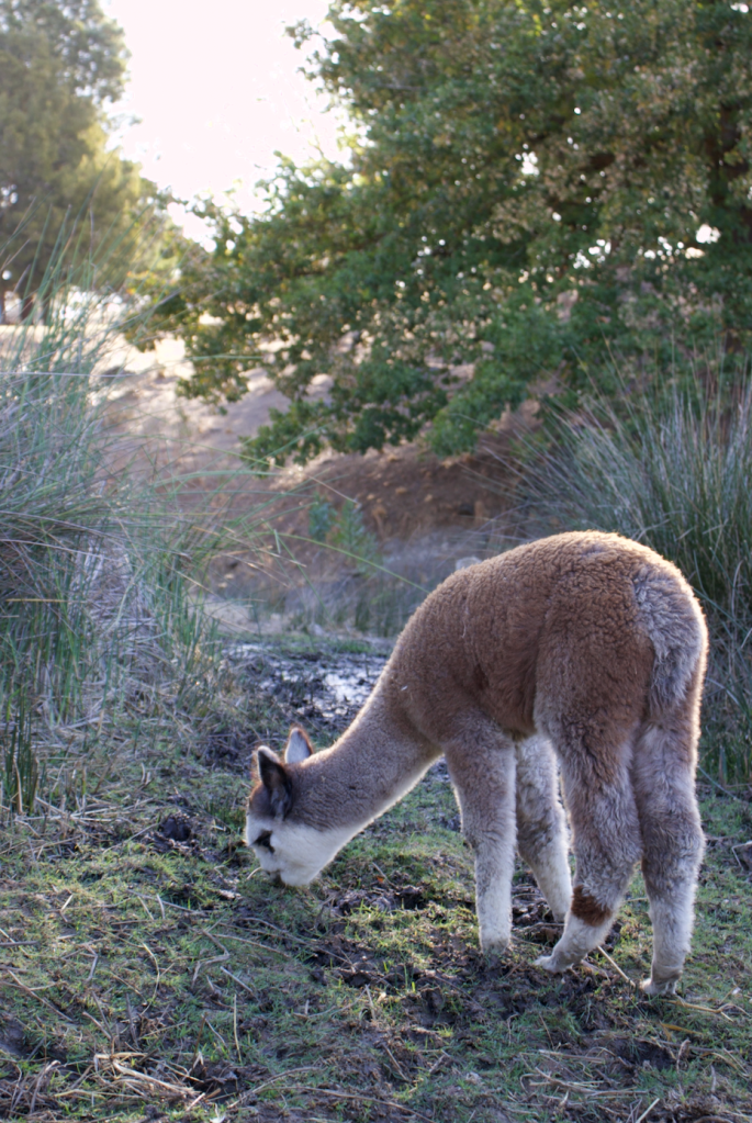
This image was edited to reduce light glare 
There was another alpaca behind the two main ones in focus, i removed it to shift focus 
The lighting on this image was darkened to create depth 
Minor touch ups such as lighting and brightness were done 
Highlights and brightness was increased 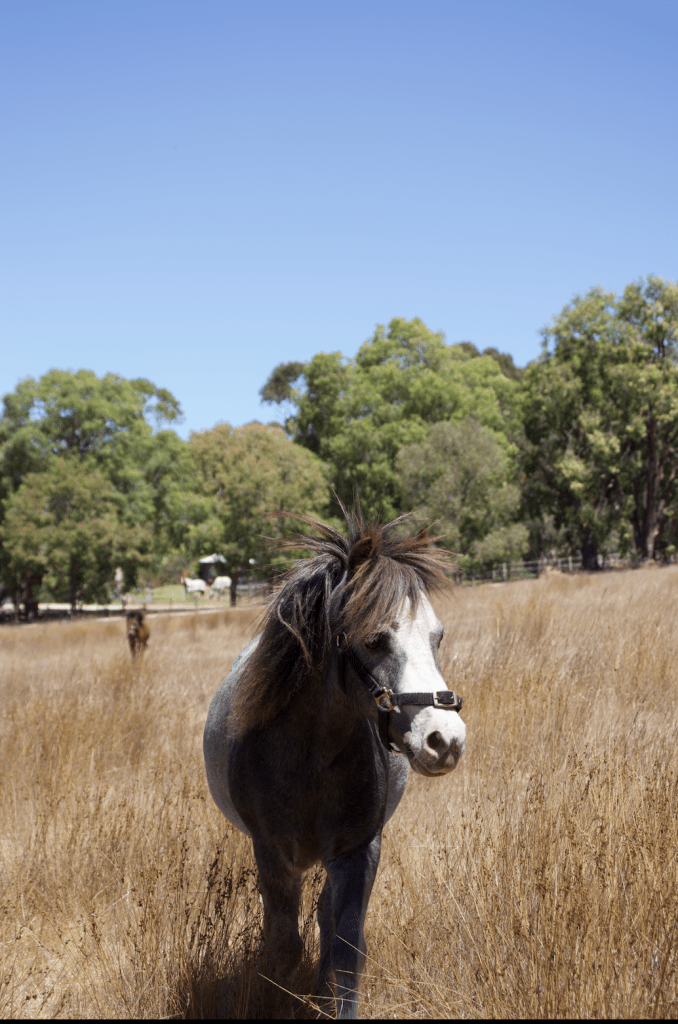
This image was cropped and had the saturation turned up for better contrast between the colours
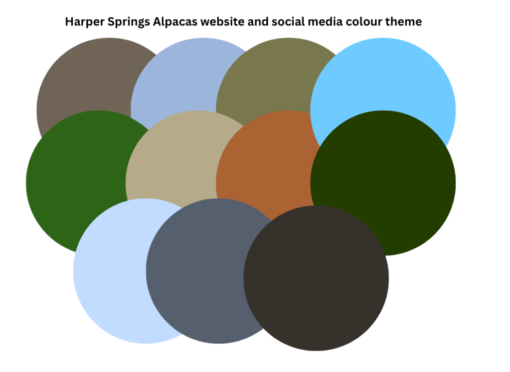
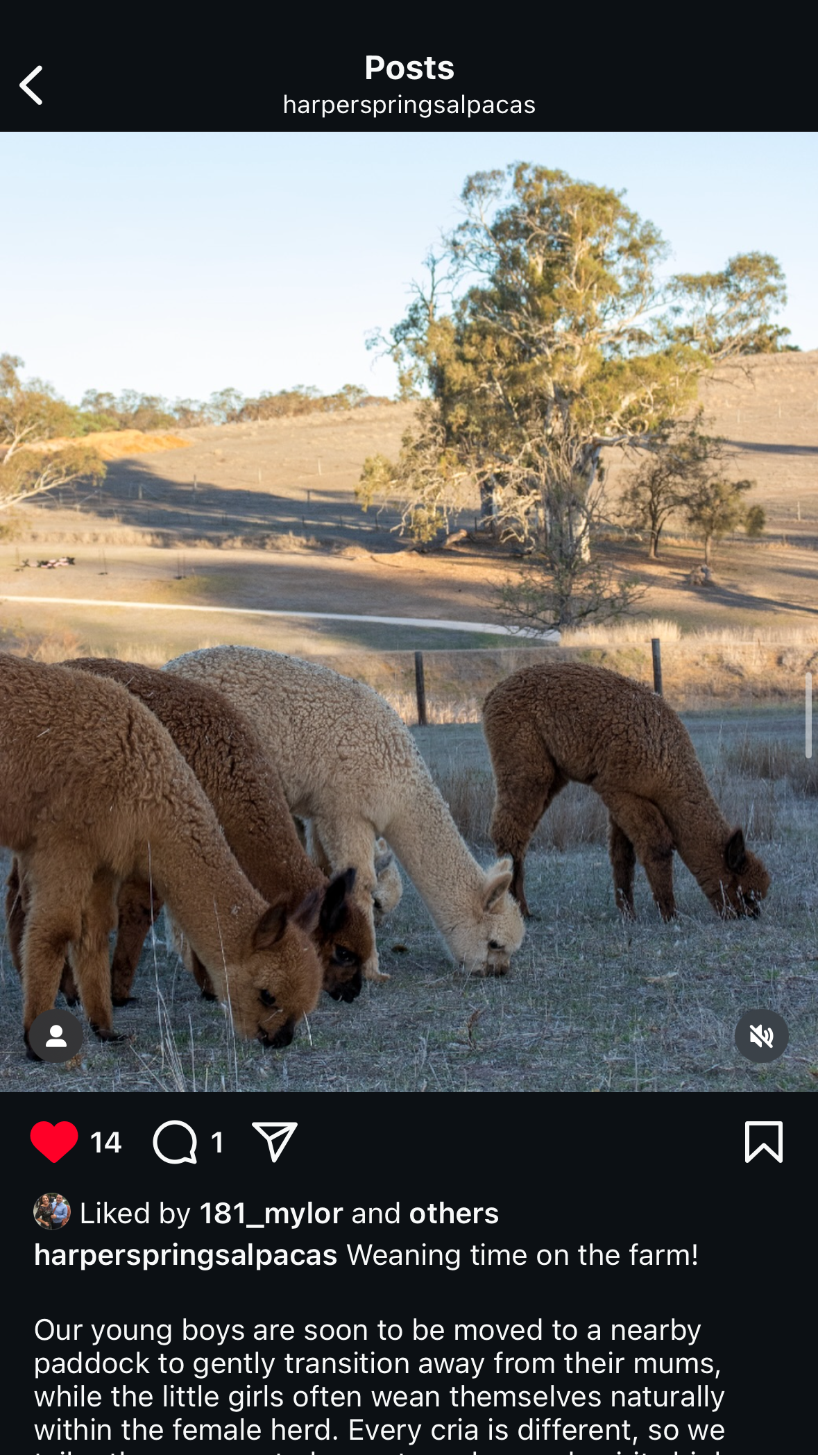
As I had previously been posting on this account prior I already had a fairly established theme when it came to colours and general aesthetics, I frequently used the colour pallet that was most common within the landscape and farm photography with colours such as greens, blues, beige, browns being the most prominent. I wanted to support my blog concept of relatable farming advice by utilising the same colours my audience would experience themselves, ultimately creating a psychological connection and familiarity for users though colours.
To further utilise bright colours I would contrast text within the images, with key intentions to keep all text easy and visible for users to read (Swasty, 2017). To further develop the brand association and intentions through colour I tried to focus on incorporating green as often as possible both through images and text as it often symbolises nature, and refreshens that builds onto the themes of the blog.
Lastly, with my brand logo I wanted to continue themes of simplicity but through a impactful design. I had already previously had a logo but it felt unfitting along with the new theme as there were multiple colours and it felt unrefined. I wanted to keep the overall design of the logo but make it more universally applicable by removing the background and smoothing out the design, I was able to achieve both of these design changes through adobe illustrator.
User Interface design
Throughout my blog design I refrained from using complex designs and structures to make the flow and visual appeal easy for users to follow, while still providing large amounts of information both about the content and the ability to navigate the site. The titles of the blogs are deliberately put in quotation marks as it is associated with quotes and personalisation, this theme is continued throughout both blog and social media interfaces.The image below displays the simple design of the blog homepage.
(Saltz, 2009) talks about how words or visual elements in upper areas receive ‘visual priority’ and convey higher importance. With this understanding I prioritised how I wanted my blog pages to be viewed. I included the site title as priority followed by the navigation bar that includes buttons to other blogs and to social media pages. To further ensure user interface simplicity I ensured each page of my blog looked consistent.
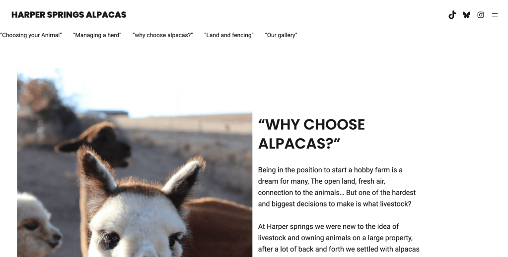

To further make my user interface relevant I highly prioritised understanding user wants and needs when navigating the website (Cho, 2013). I ensured my website home page displays information in order of importance and value as users navigate the page, initially the title page displays both logo and website title, following this leads to the ‘about’ page with information on the purpose and brand as a whole, then lastly are the blog title pages and the contact pages for specific questions. The intentional use of simple layouts makes the directional intentions of the website clear to users, leading to straight forward navigation.
user experience across digital platforms
As personally being on a variety of different media platforms I understood there were a range of different audiences across each. I wanted to prioritise getting maximum exposure in order to gain the most traction possible towards the website.in addition to the website I created a BlueSky account (@Harperspringsalpacas) I previously had a Instagram and tiktok account prior to the assignment but in order to link them I changed the content and shifted it towards hobby farming, ultimately transforming the foundations of the account. I kept the username and profiles (logo) the same throughout all accounts in order to be easily recognisable and searchable.

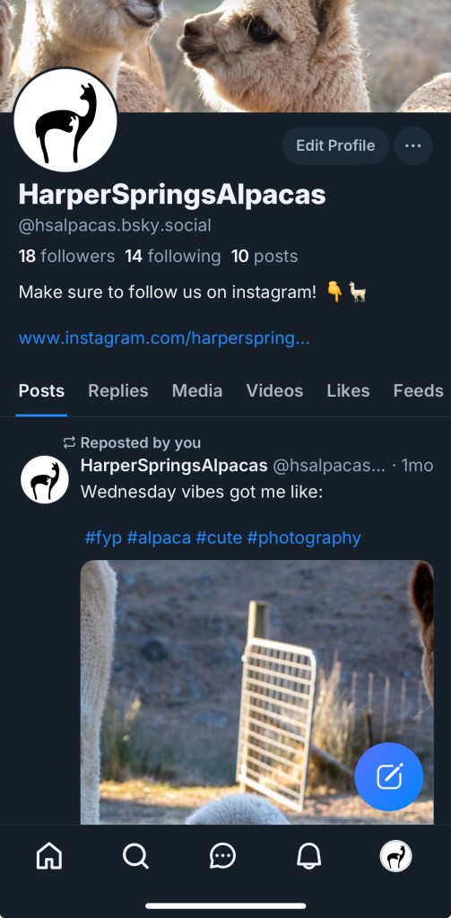
As I navigated managing each platform I ran into affordances and constraints such as the ability to target new audiences. I felt my posts on BlueSky got a significant amount of interaction immediately as the posts were shared, compared to tiktok where content really lacked engagement and reach.
Overall I found Instagram to be the most consistent and accessible platform to share content on as there were a range of different styles to post such as stories, reels and posts. Instagram also provided detailed insights and a steady incline when it came to engagement (Cohen, 2015).
In summary Instagram functioned as a platform for growth as it best demonstrated the intention of the brand and got a steady incline of engagement, tiktok with vitality has the potential to spike popularity but its very randomised and difficult to enter the algorithm and lastly I think BlueSky has the potential to progress views but the engagement never went further then likes, ultimately leading to no further user investment.
Audience metrics
Audience metrics are important as they provide content creators with specialised data on audiences and content reach and interactions. These factors supplied by the social media platforms allow for effective changes and shifts in content in order to gage maximum audience reach ultimately leading to success within the platform and successful marketing. The images below display audience views of both content and profile views within Instagram As well as the engagement on posts.


From the statistics I can access from Instagram I can see my overall view count is significantly higher then my engagement. It can also be seen that the Instagram stories had a significantly higher reach then posts, through observation the views were most likely higher amongst stories as I would post that form of content a lot more frequently then regular posts.
I often used Instagram posts as a way to promote informative content that strongly relates themes to the blog, giving the audience a small insight to the content that is available within the blog, furthermore I utilised Instagram reels as a way to share fun up beat content that was often targeted at featuring on the algorithm in order to expand reach and views. Following this I would then re share all content forms onto my story Aswell as promotional content for the website and other forms of media such as photos, and videos deliberately for the story. Due to this factor I think it largely impacted the view count of stories.
extension of research and learning and reflections and future directions
For this task my learning and research goals ranged from a number of areas of interest, firstly i’ve always wanted to create my own website for Harper Springs Alpacas but I found I never had the right recourses and guidance to be able to achieve that, so being given the opportunity and creative freedom really led me to become passionate and excited about the course and learning. Furthermore my goals were to trial new forms of content and styles of engagement, overall I’m extremely please with the themes, application of learning and final product of this course, leading me to feel supported with both my creation and ideas. Ultimately I have goals of turning this course concept into a real business with farm experiences and activities that can be booked though the website I have produced and I also intent to continue posting creating a community surrounding Harper Springs Alpacas!
Additionally with positive peer feedback surrounding my website I believe there is significant potential for growth and further development both as a social platform and as a real business. I aim to continue posting Weekly with new forms of content, I will also continue to take all of my own photographs as it is another aspect to the website and social media platforms that make it so visually engaging. Overall I’m extremely happy with the final design and I’m interested to see what the future brings for Harper Springs Alpacas
References
Cho, S. &. H. S., 2013. Blog User Satisfaction: Gender Differences in Preferences and Perception of Visual Design’. Social Behaviour and Personality, 41(8), pp. 1319-1332.
Cohen, J. &. K., 2015. Producing New and Digital Media: Your Guide to Savvy Use of the Web, New York : Focal Press.
Saltz, I., 2009. Typography Essentials: 100 Design Principles for Working with Type, Osceola: Typography Essentials: 100 Design Principles for Working with Type.
Swasty, W. &. A., 2017. Does Color Matter on Web User Interface Design. CommIT (Communication and Information Technology) Journal, 11(1), pp. 17-24.
Zhang, L., 2017. Design and Research on Visual Communication under the Influence of Digital Media, Yan’an: Luxun College of Art, Yan’an University.
